Dead Space Remake
Designing Industrial Horror in 3D
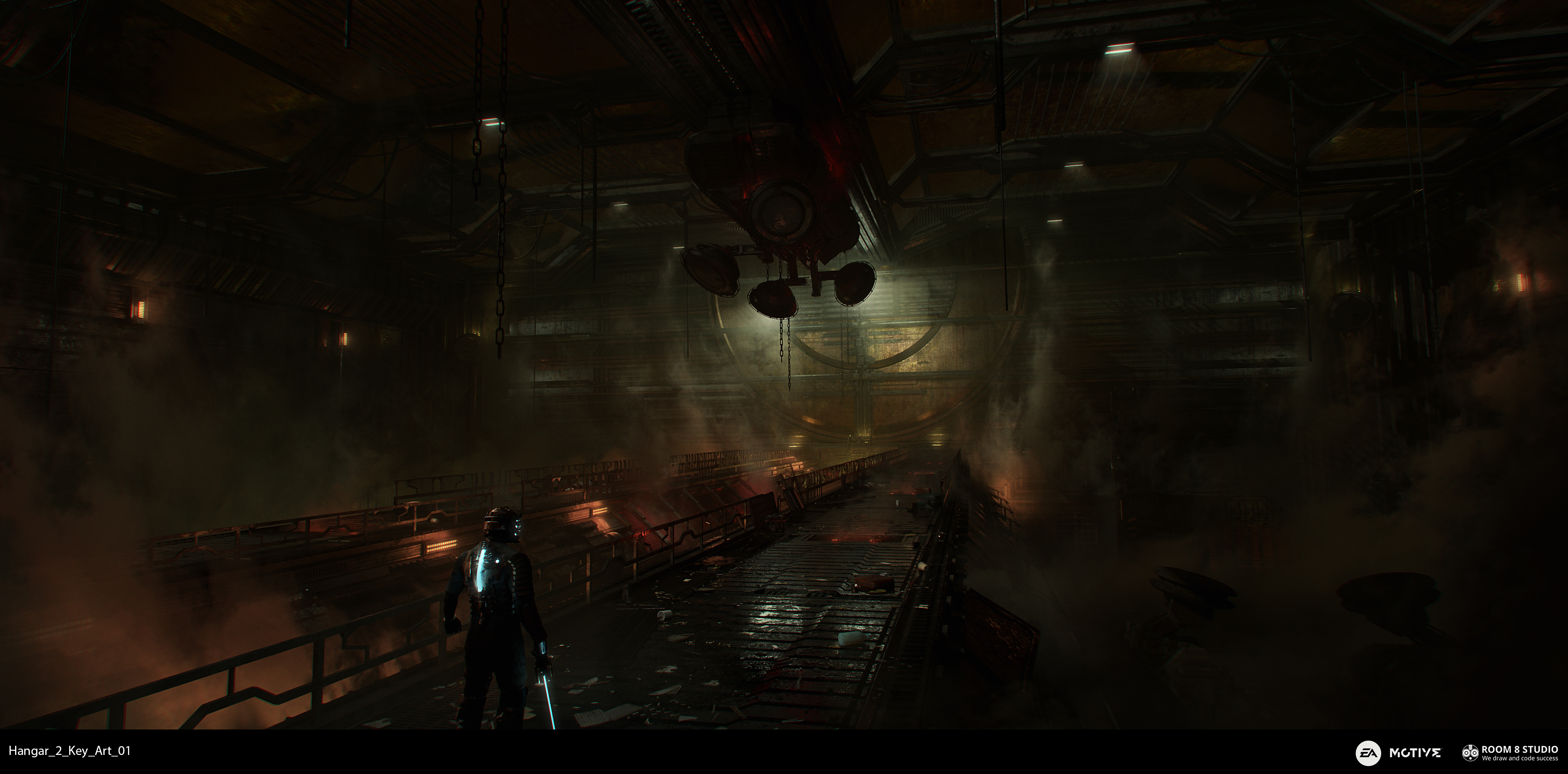
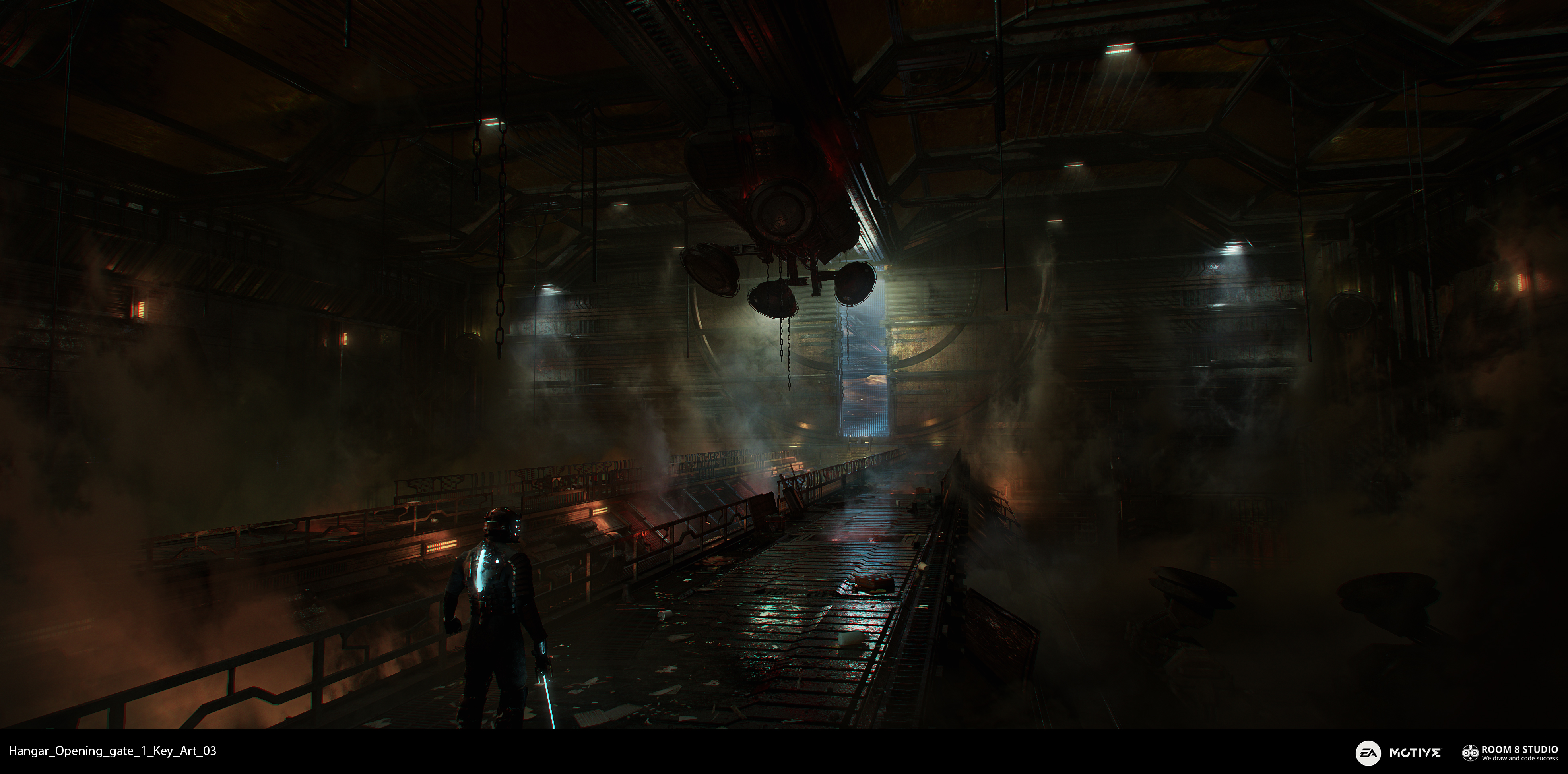
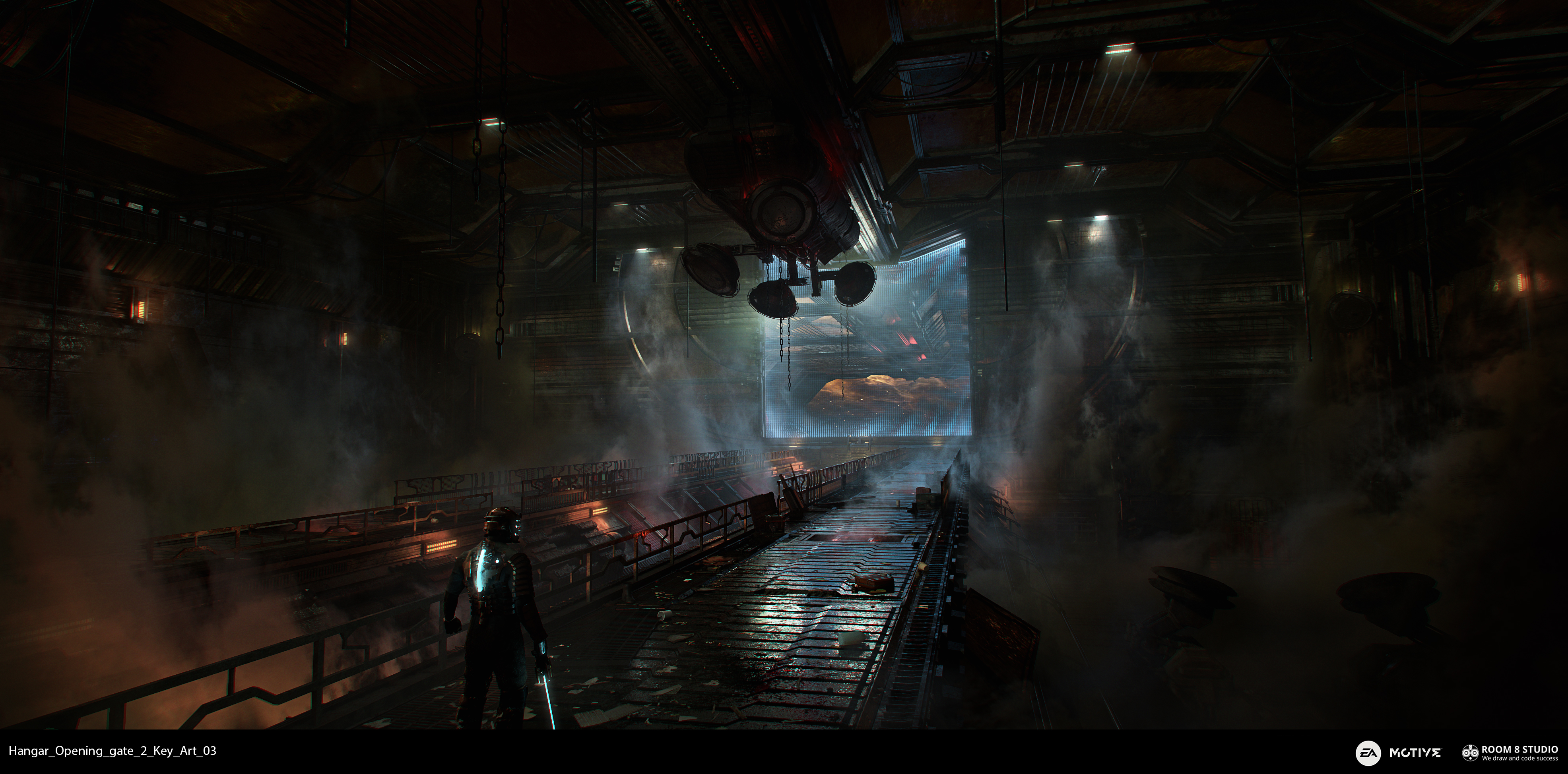
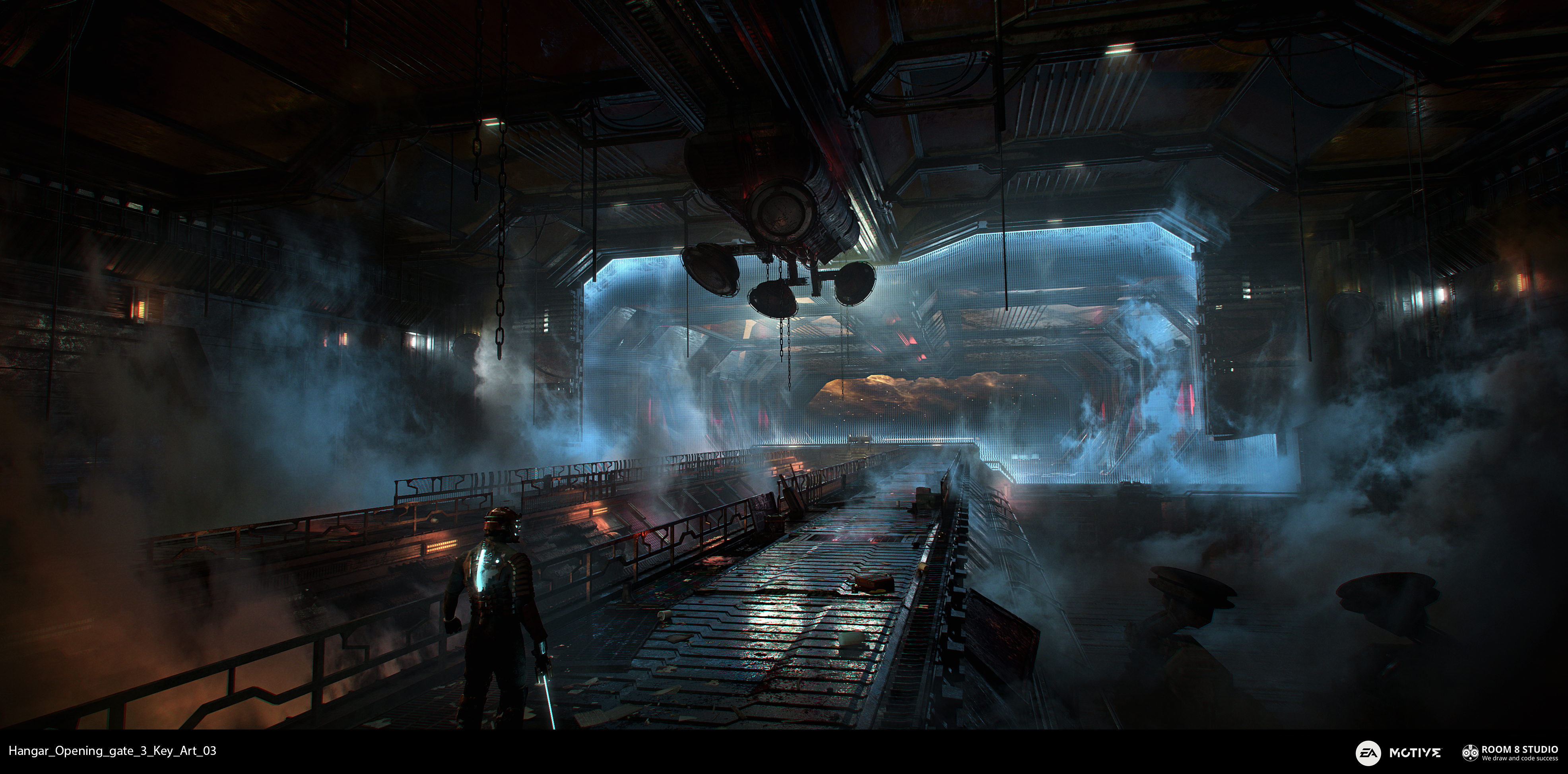
Hangar gate sequence, 3D concept design and key art development.
I worked as a Concept Artist on Dead Space Remake, focusing on complex environment design tasks for the USG Ishimura, including hangar spaces, ship interiors, props and production-focused hard-surface concepts.
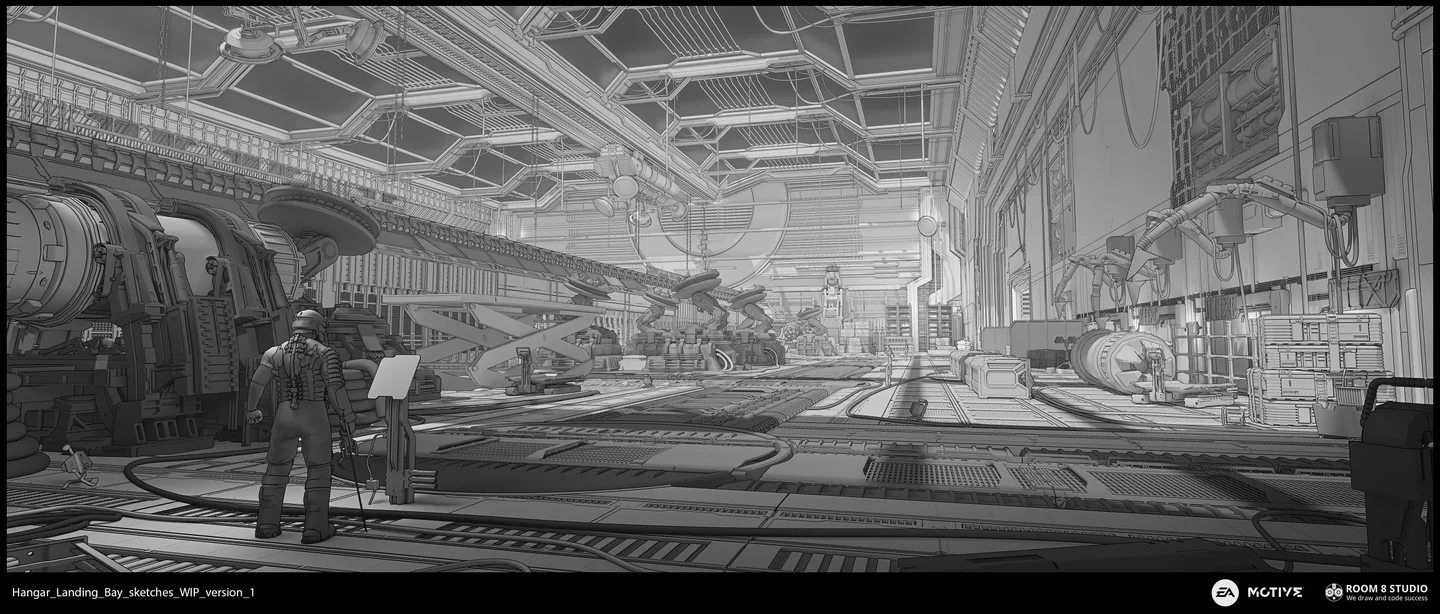
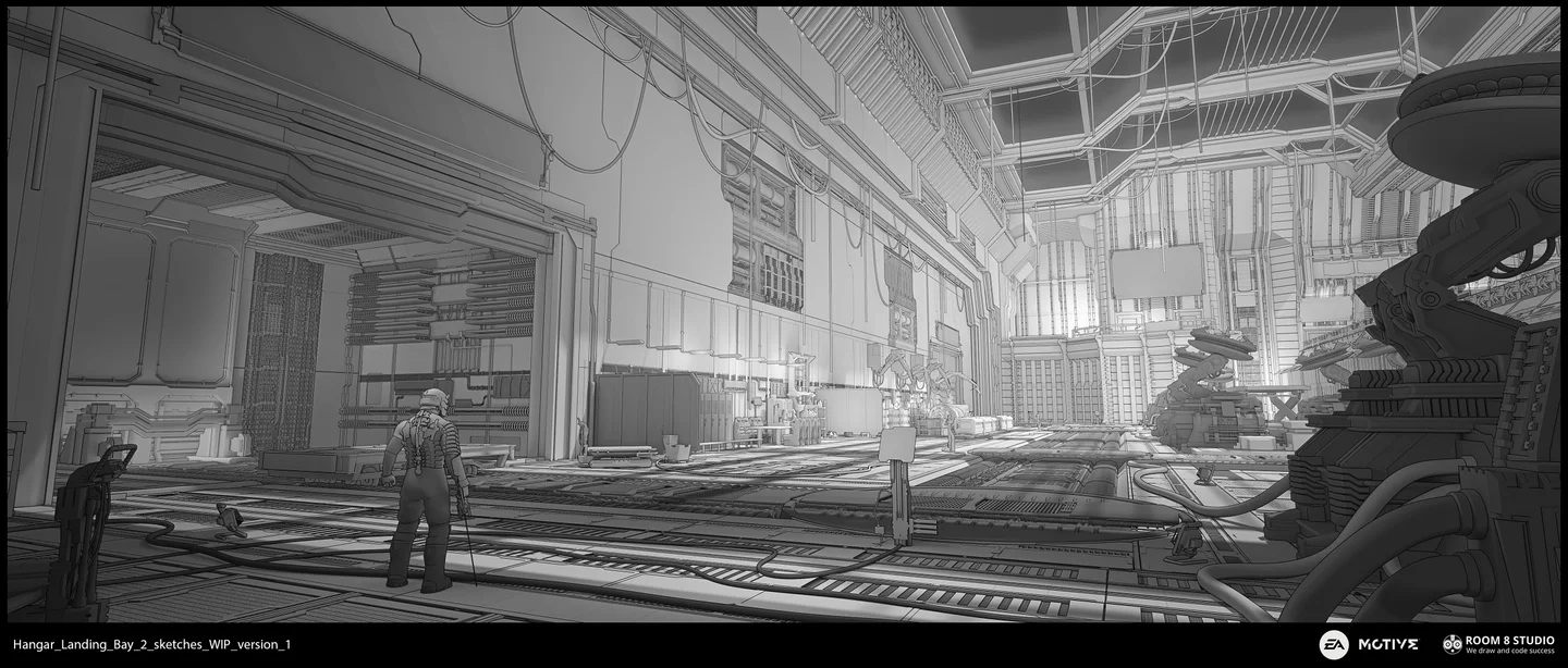
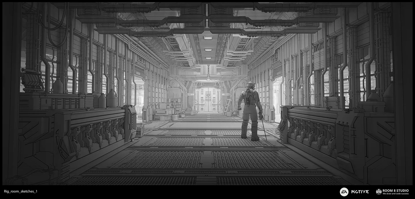
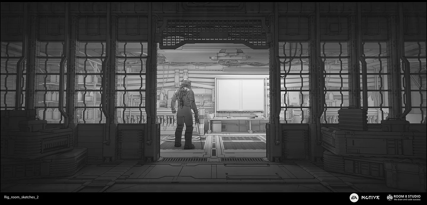
A lot of this work was built in 3D from the earliest stages. Even the “sketches” were not simple drawings. They were detailed hard-surface models presented through custom line-art and clay-style shaders, so the art director and production team could read the construction, rhythm and functional logic of every form.
Entering the Ishimura
Dead Space was not about making a spaceship look cool. The Ishimura had to feel like a working industrial body, something built for extraction, pressure, noise and survival. Every wall, pipe, rib and panel had to support that feeling.
For me, the strongest part of the project was learning how much of the horror came from design rules, not just monsters. The ship needed to feel functional, but also sick. Metal had to be heavy, wet, reflective and worn down. Walls had to feel layered, as if you could look through broken panels and see the ribs, cables and mechanical organs underneath.
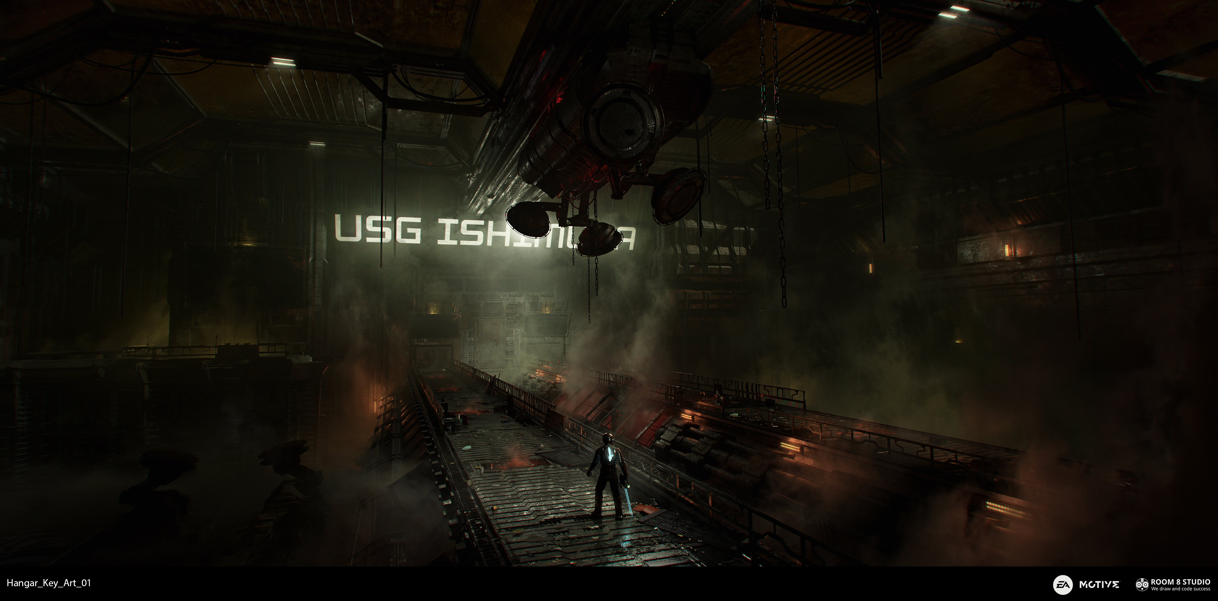
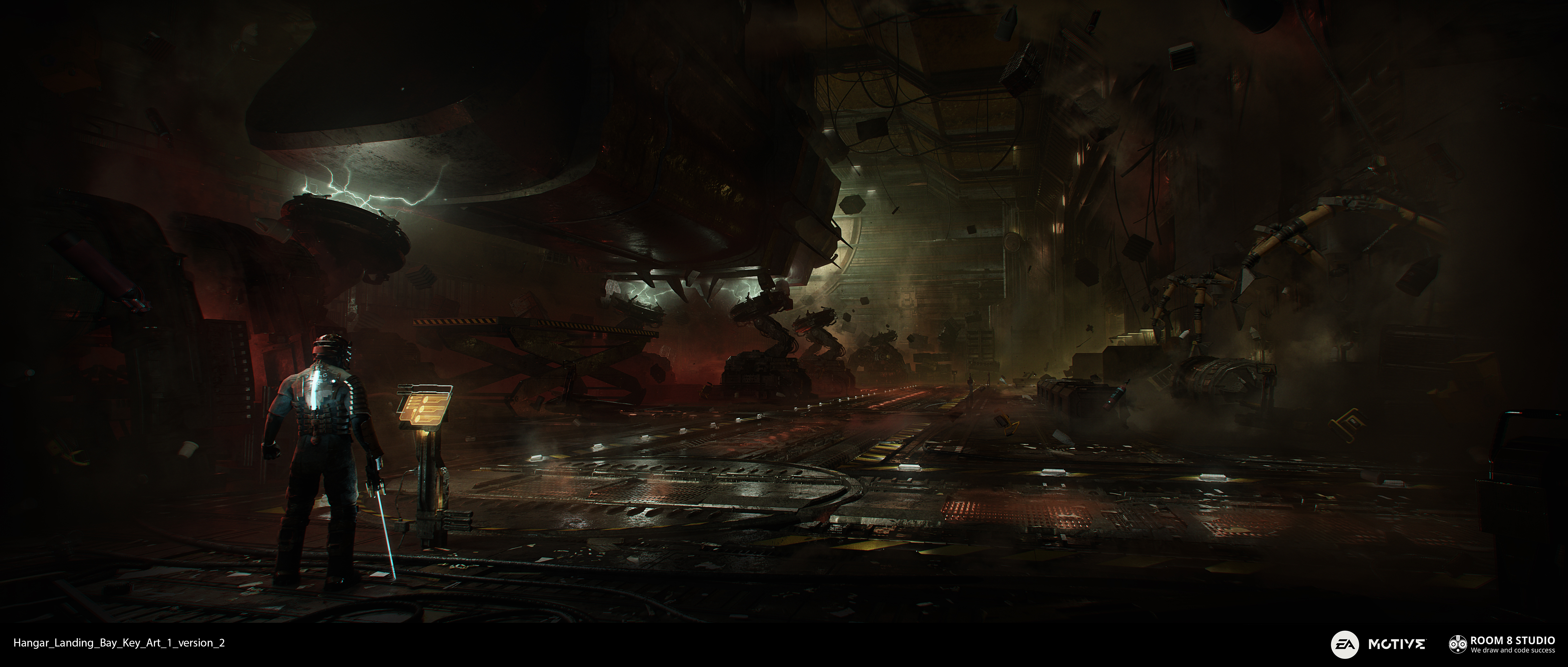
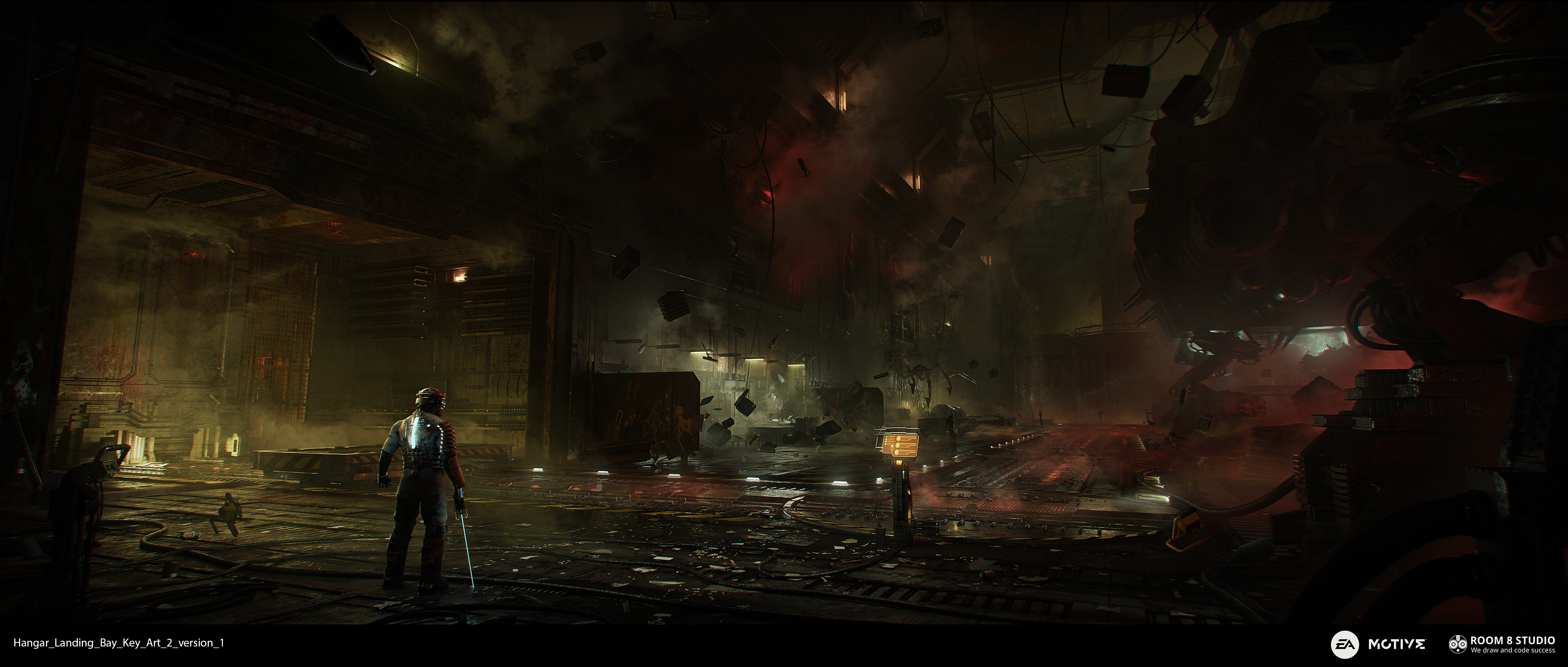
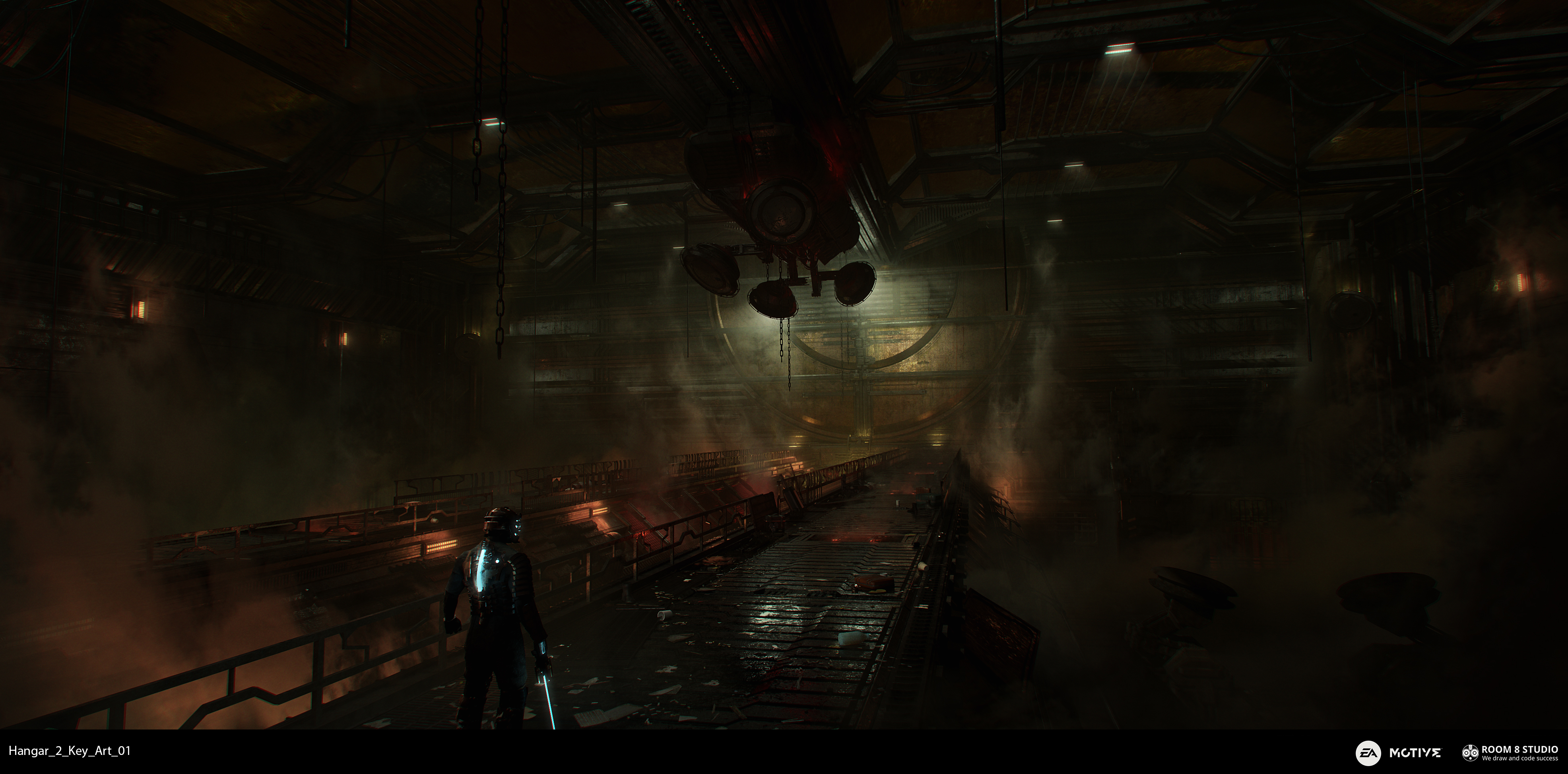
Hangar key art, final mood and lighting pass.
The remake problem
Working on a remake creates a very specific design problem. The goal is not to simply polish old visuals or cover them with new textures. You need to rebuild the world with modern production standards, while preserving the memory of the original.
The original Dead Space had a very strong shape language: simple, angular, rectangular, industrial and repetitive. In the remake, the geometry could become far more detailed, but the core language still had to feel familiar. The challenge was to add depth, layering and modern material quality without breaking the identity of the old ship.
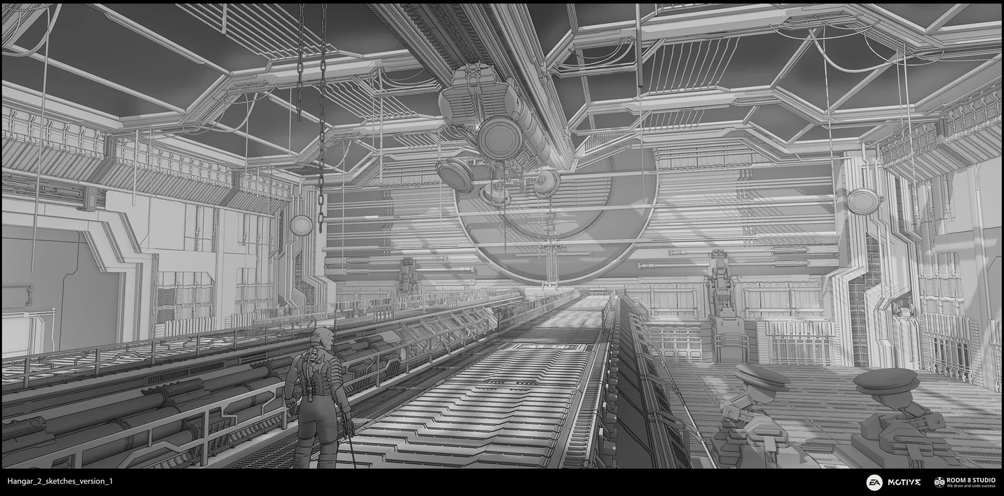
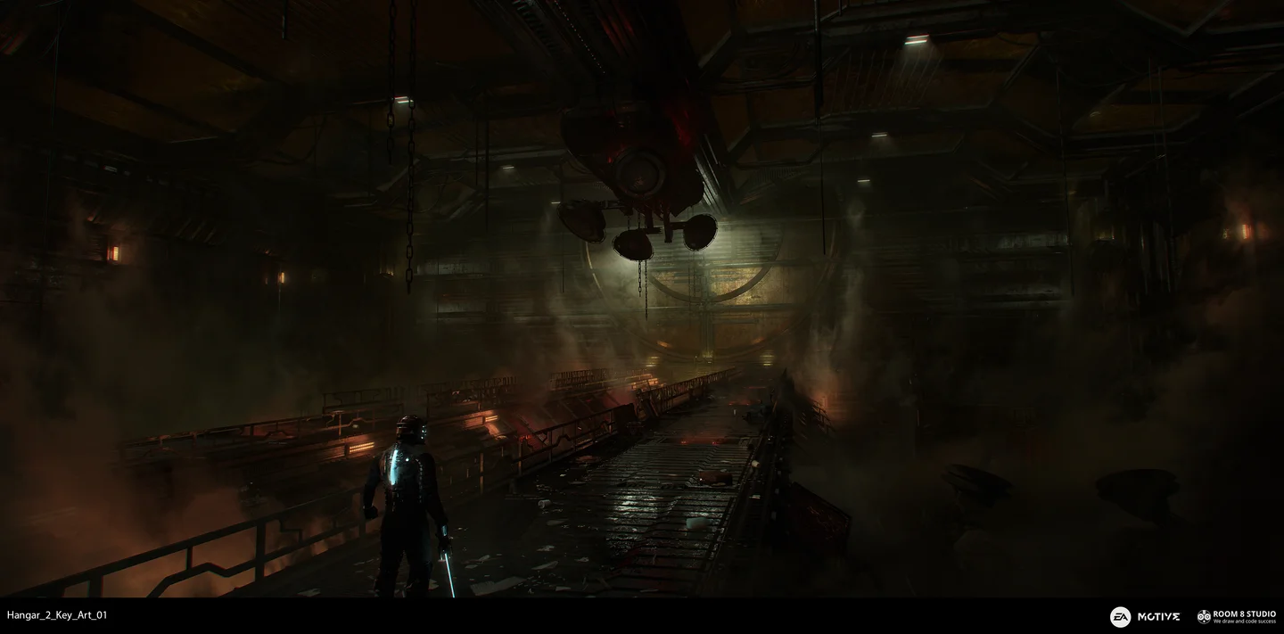
Sketch-to-final comparison, preserving the original shape language while rebuilding the design with modern production detail.
3D sketches that were not really sketches
One of the most unusual parts of the workflow was the sketch stage. On many projects, a sketch means a fast 2D drawing. On Dead Space Remake, even early design stages were often built in 3D.
The line-art presentation helped us show the density of the hard-surface design without losing readability. With Dead Space, a regular render could easily hide the construction under darkness, reflections and smoke. The line shader made the ribs, panels, frames and repeated mechanical layers easier to read, so the art director could evaluate the design itself before the final mood pass.
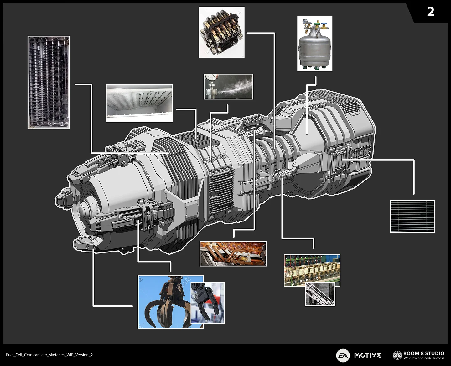
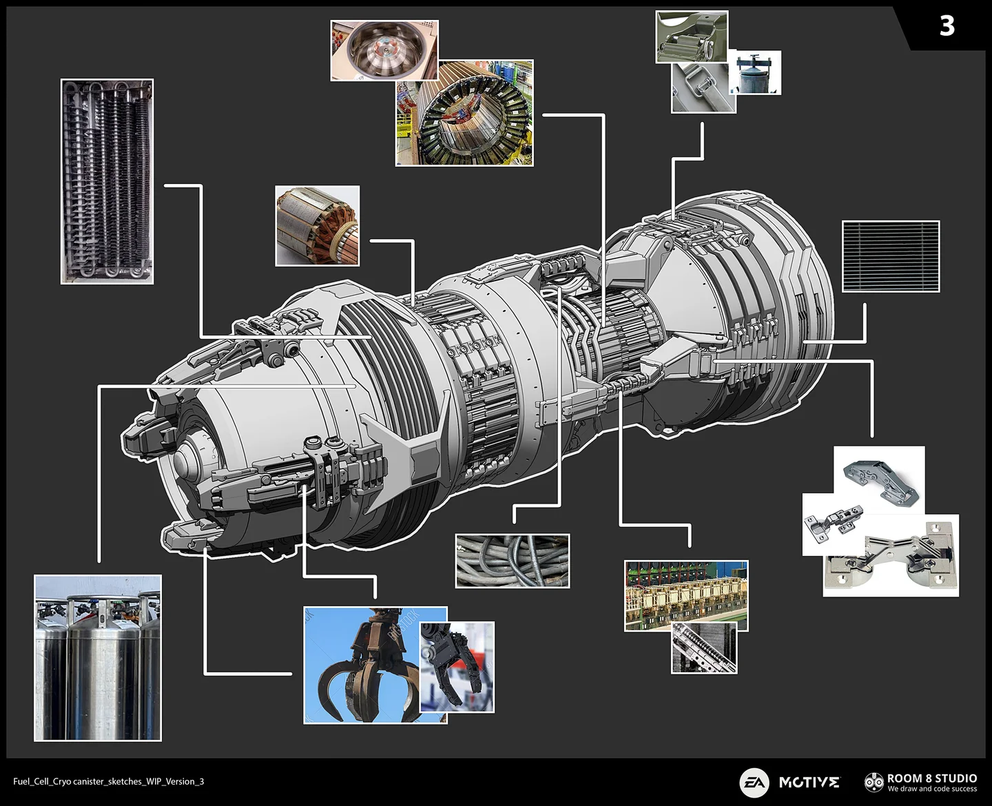
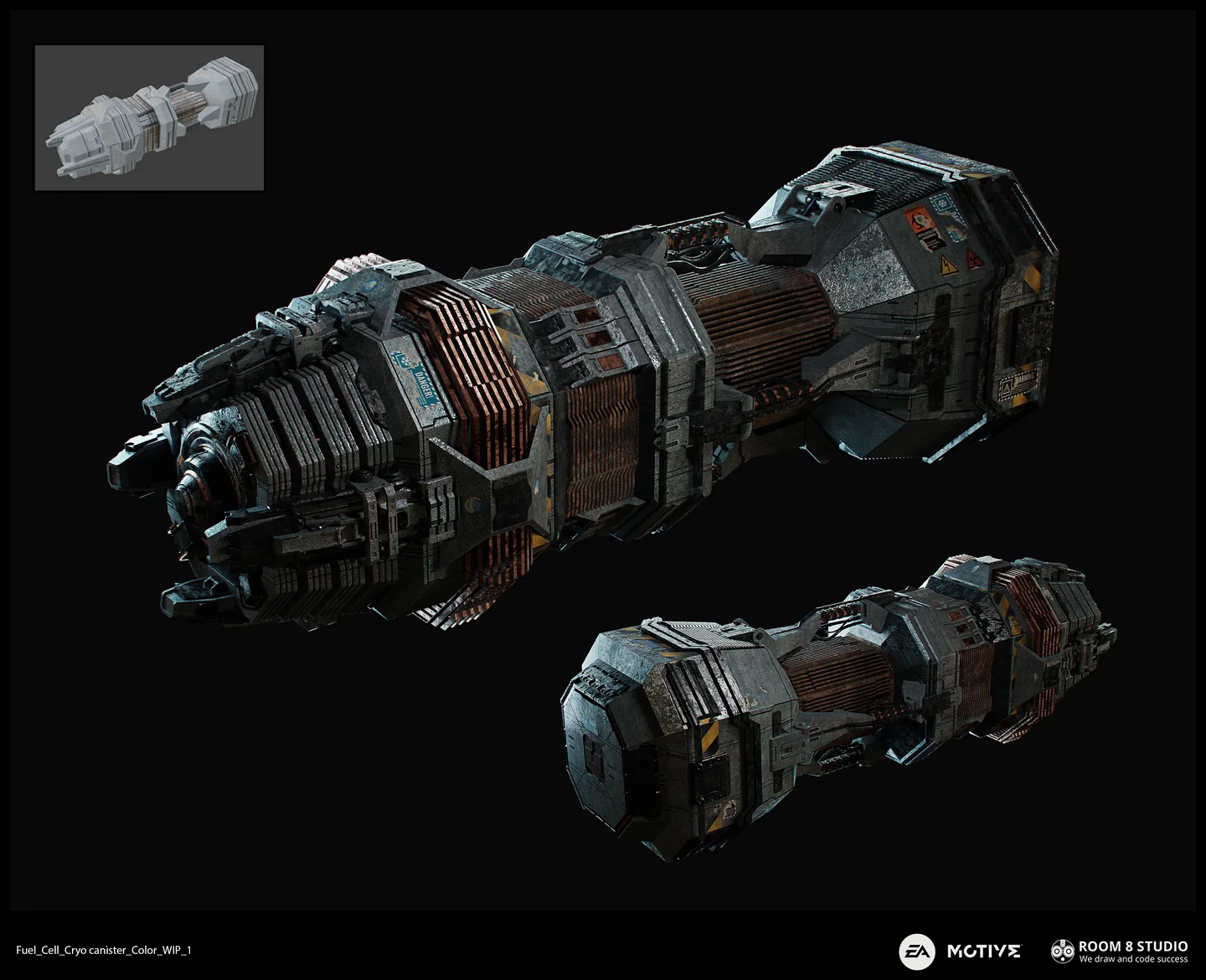
Fuel Cell / Cryo Canister, design variations and final color pass.
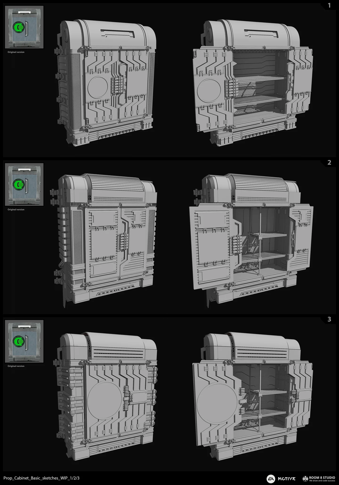
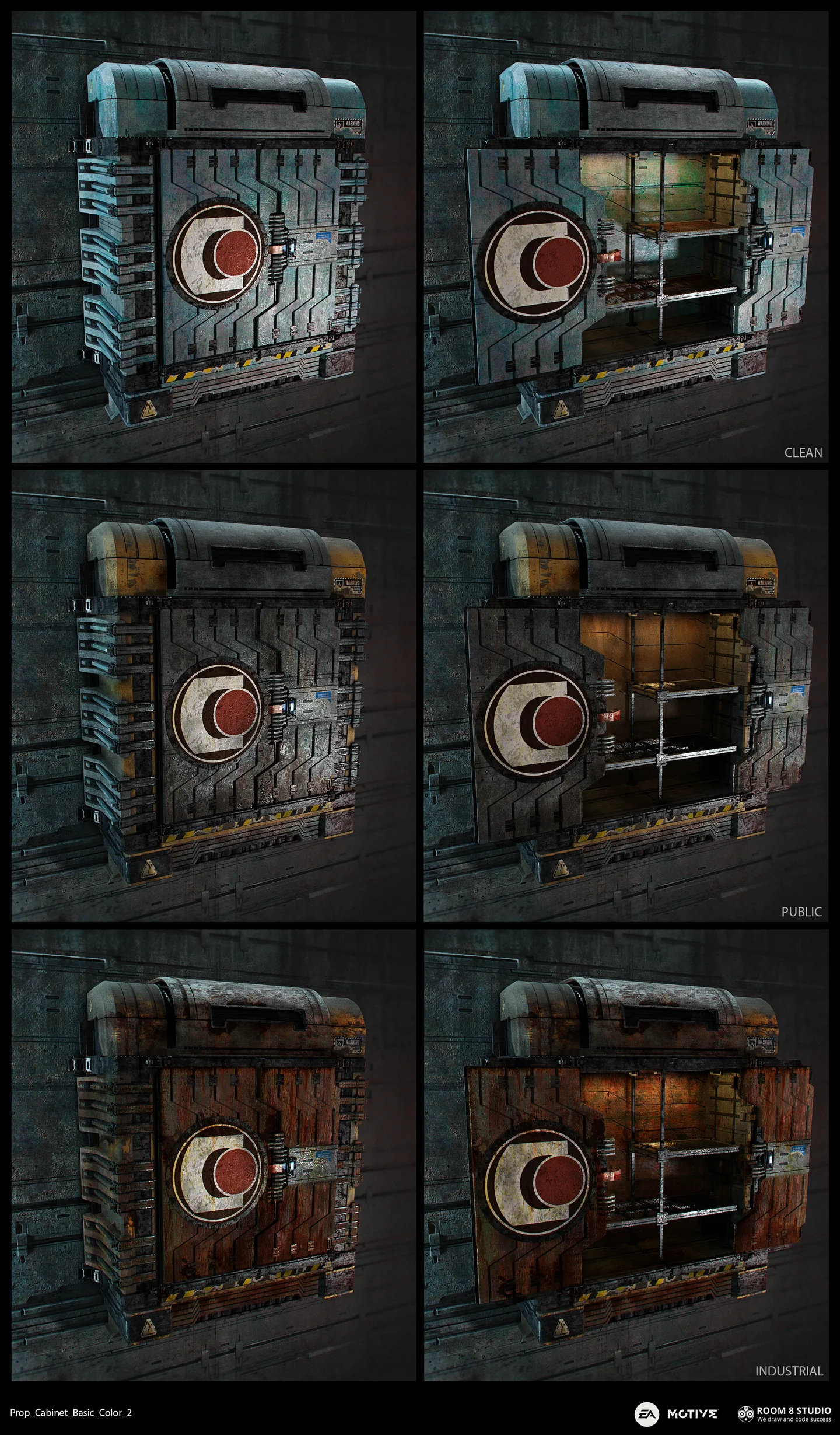
Prop cabinet design, sketch exploration and color development.
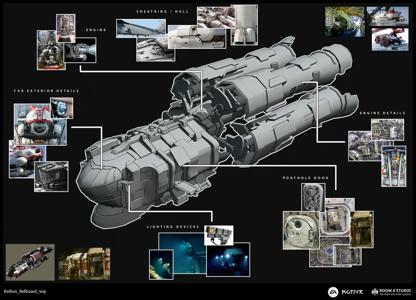
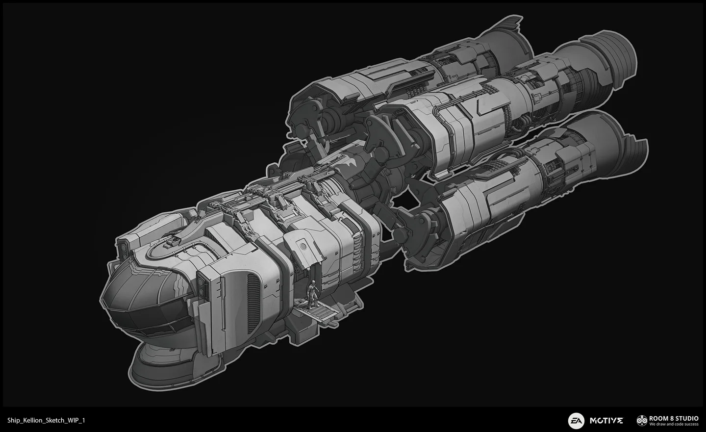
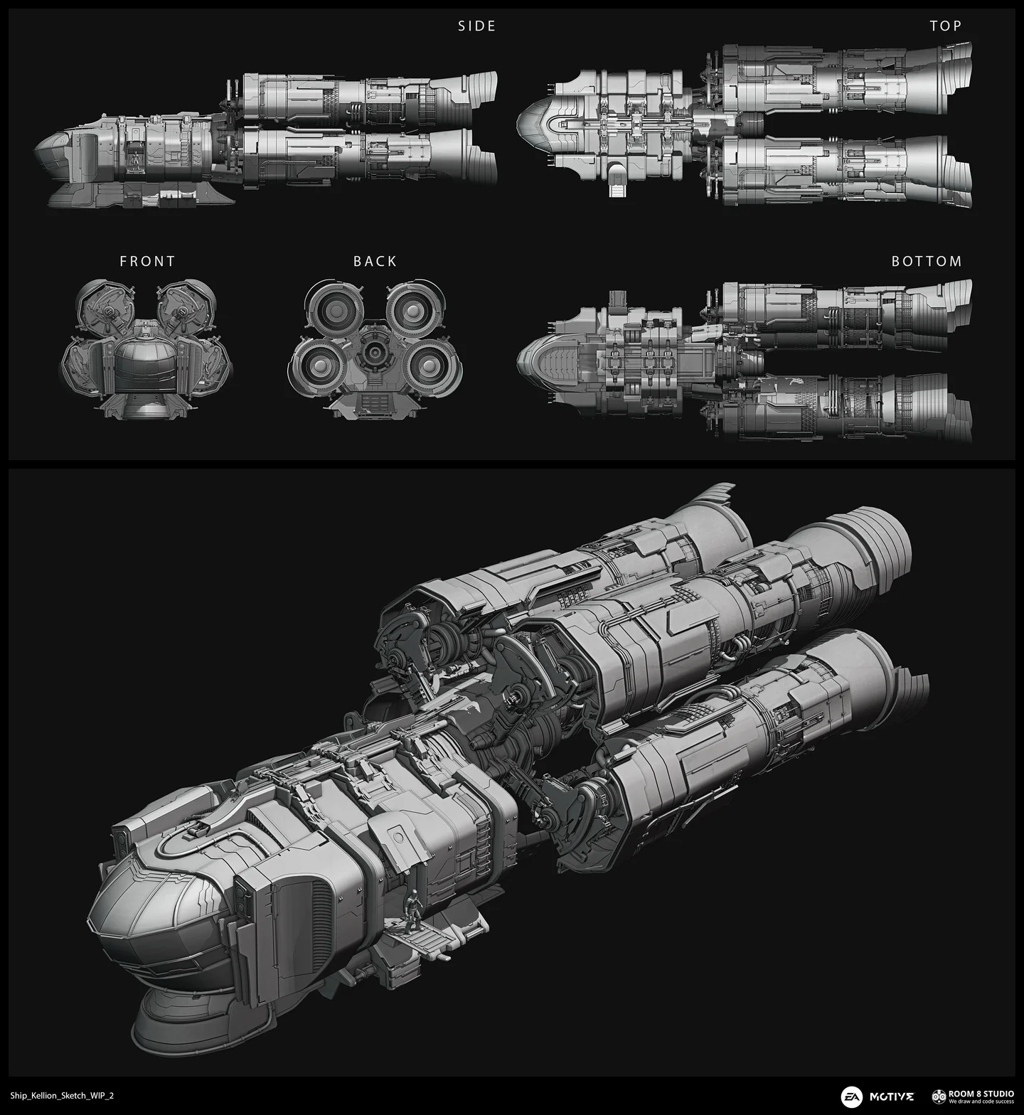
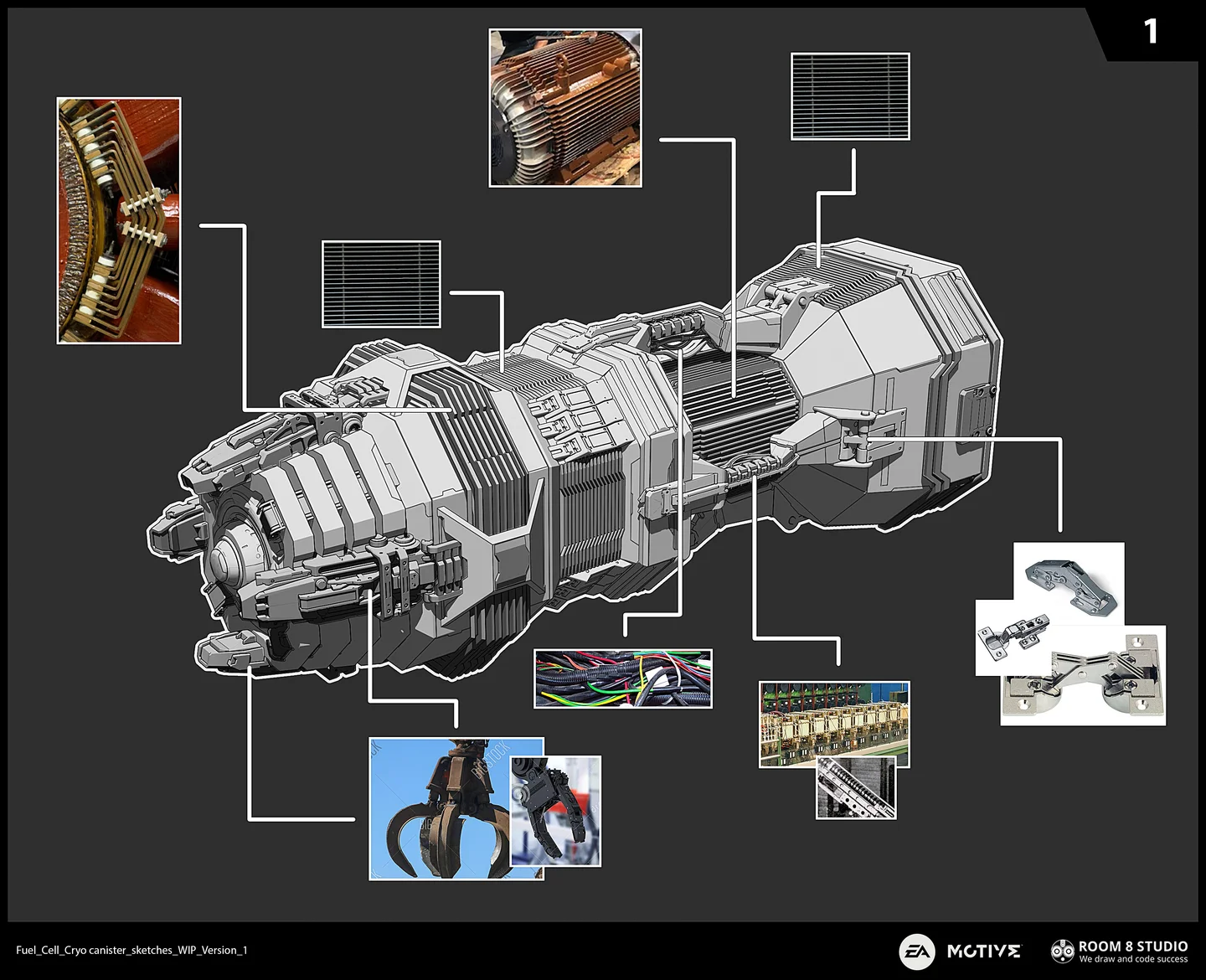
Mechanical design and reference callout sheets used to communicate form language, materials and production direction.
Function first
The design language was extremely utilitarian. I tried to avoid decorative shapes that existed only to look interesting. If a detail was there, it had to feel like it had a reason: structure, cooling, access, reinforcement, maintenance, storage or damage.
That logic helped make large spaces feel believable. A hangar could not be just an empty cinematic room. It needed engineering zones, storage, maintenance elements, large doors, mechanical systems and signs that people had actually worked there before everything went wrong.
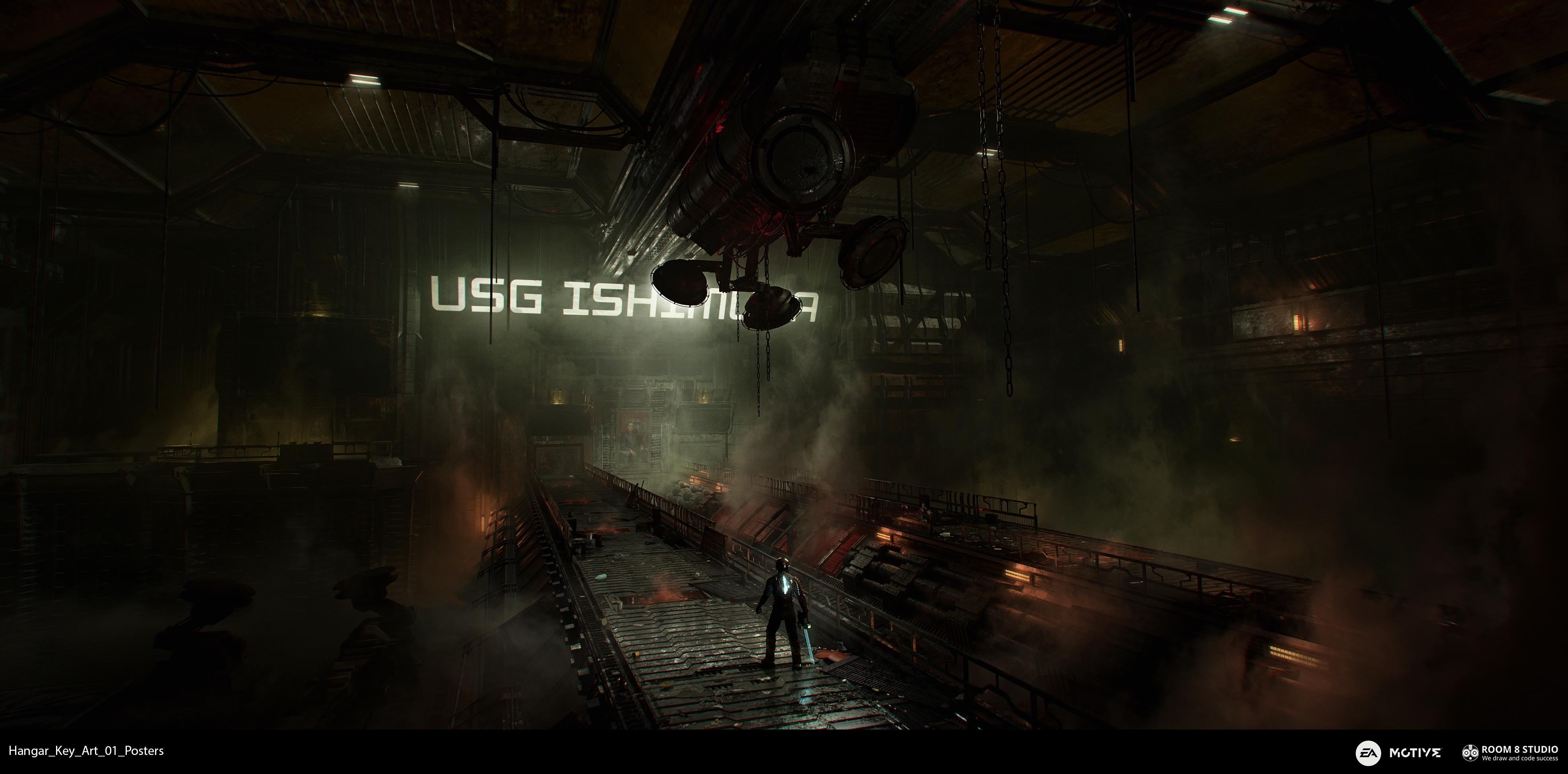
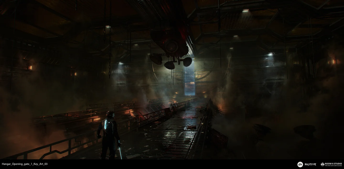
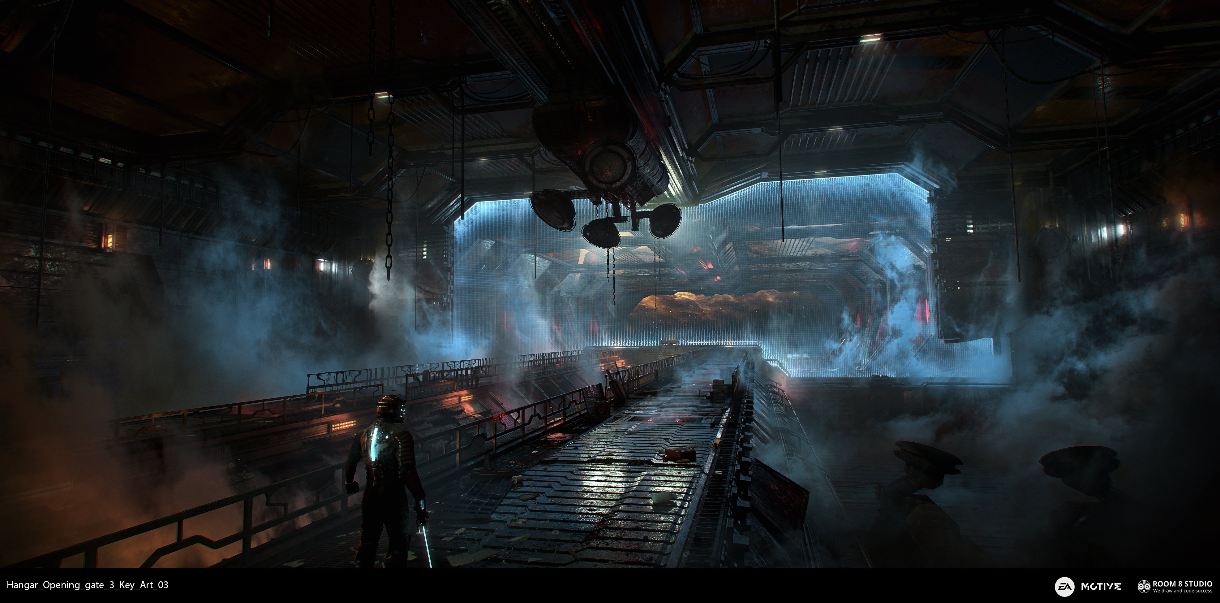
Hangar Gate Sequence
The gate sequence was designed to communicate the mechanical transition of the hangar space, from a closed industrial mass to a more readable, atmospheric opening.
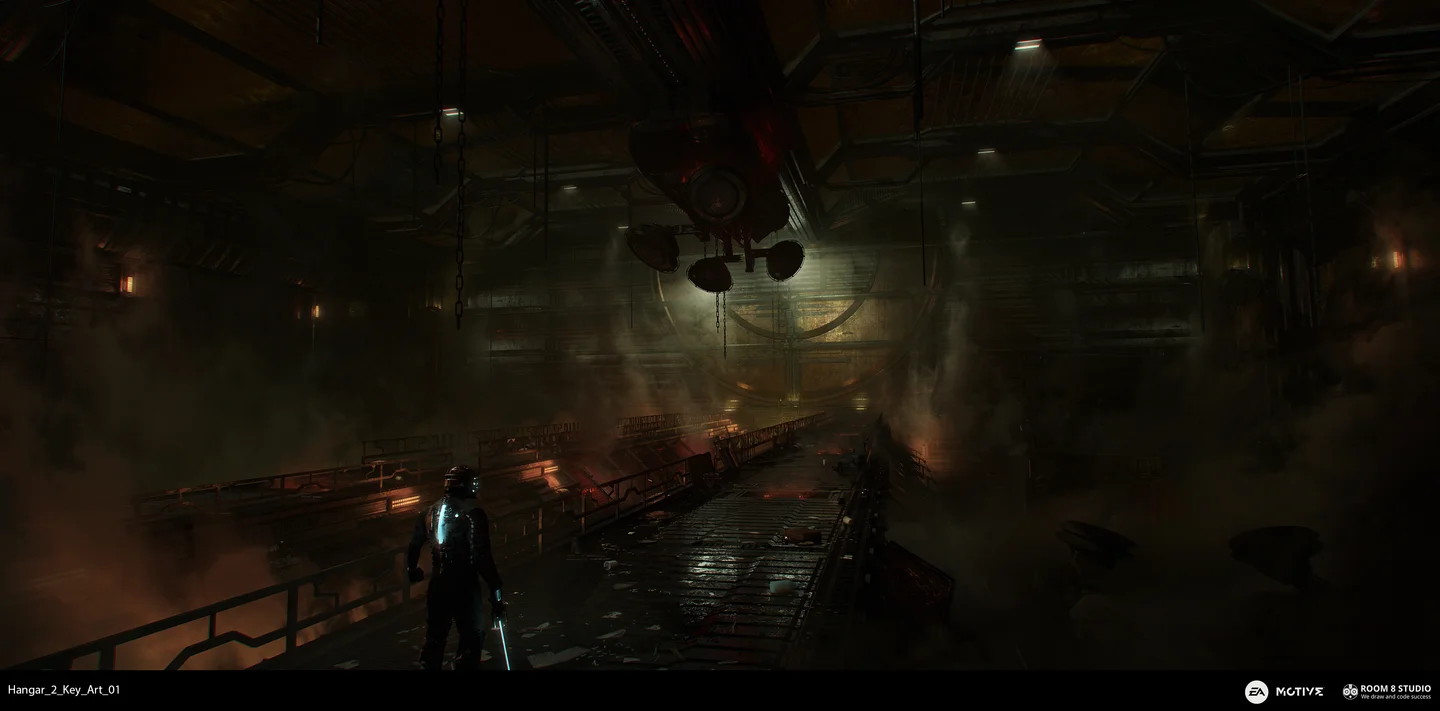
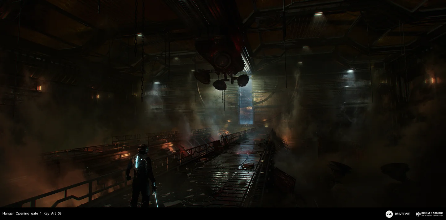
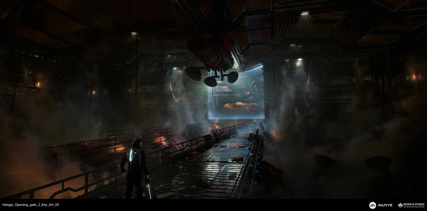
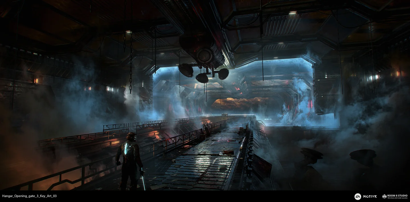
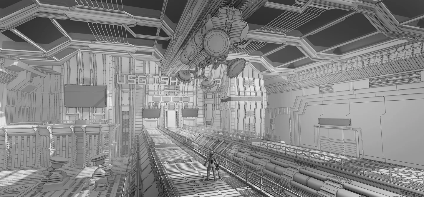
Some parts of the work were shown directly from the 3D viewport. These were not final presentation images, but they were useful for communicating structure, scale and mechanical logic before the mood and lighting pass.
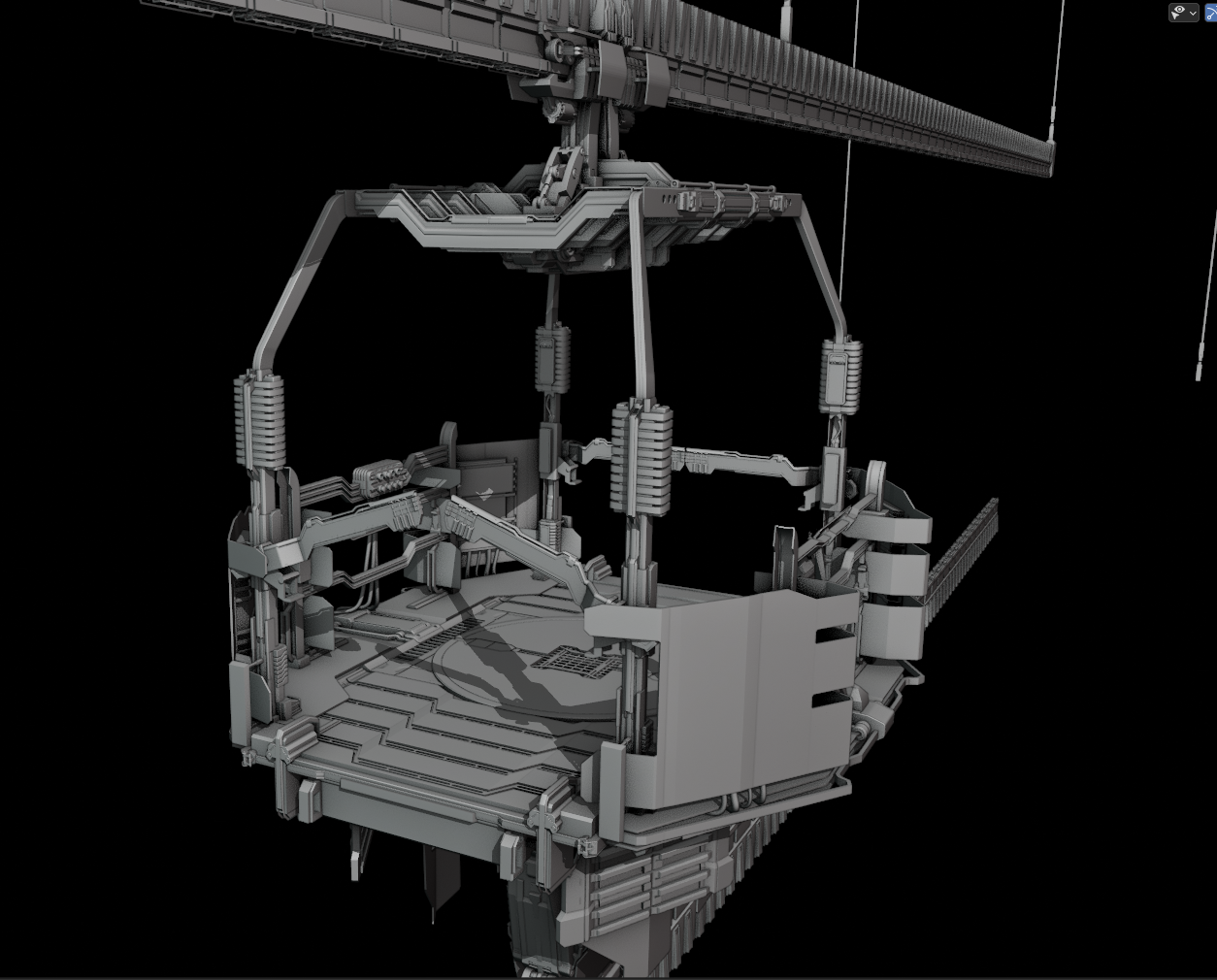
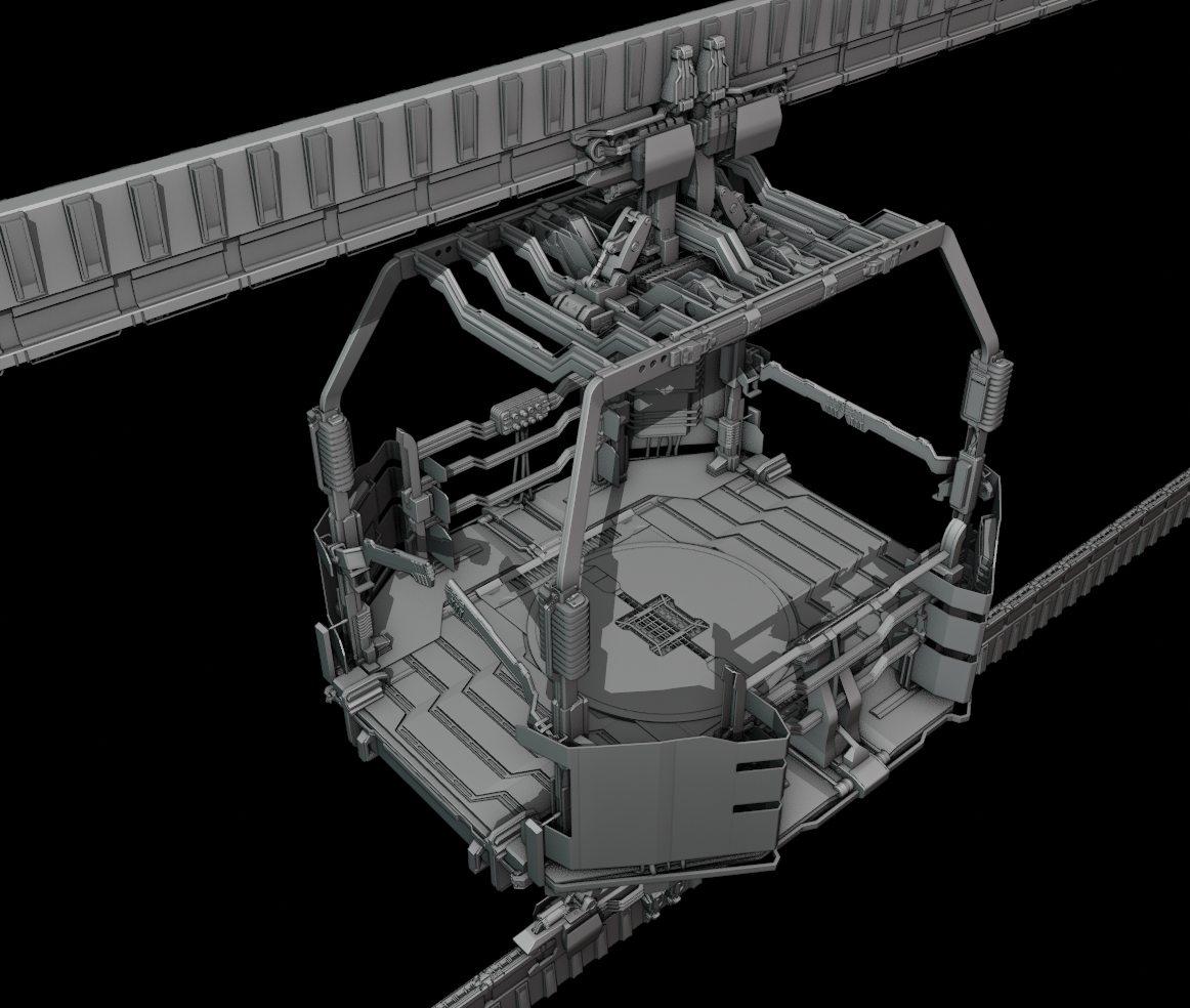
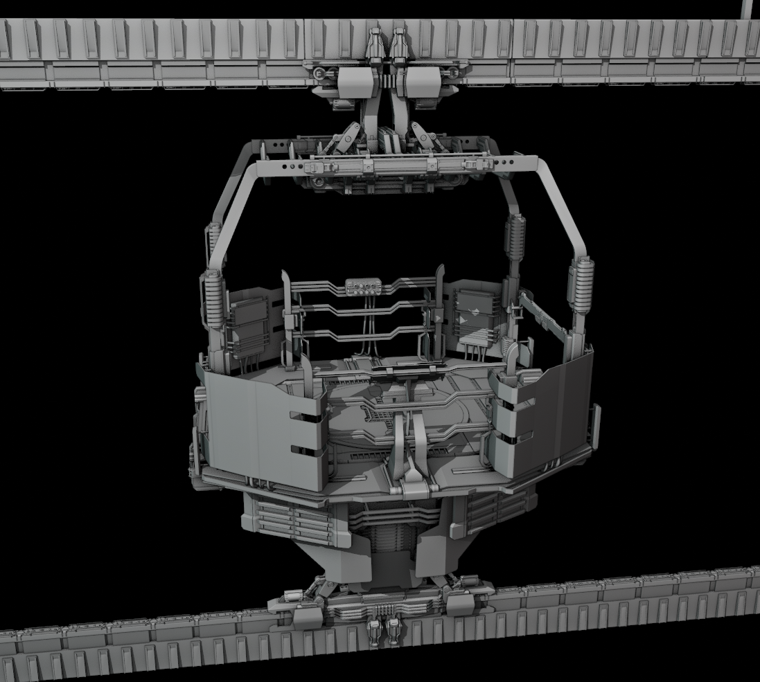
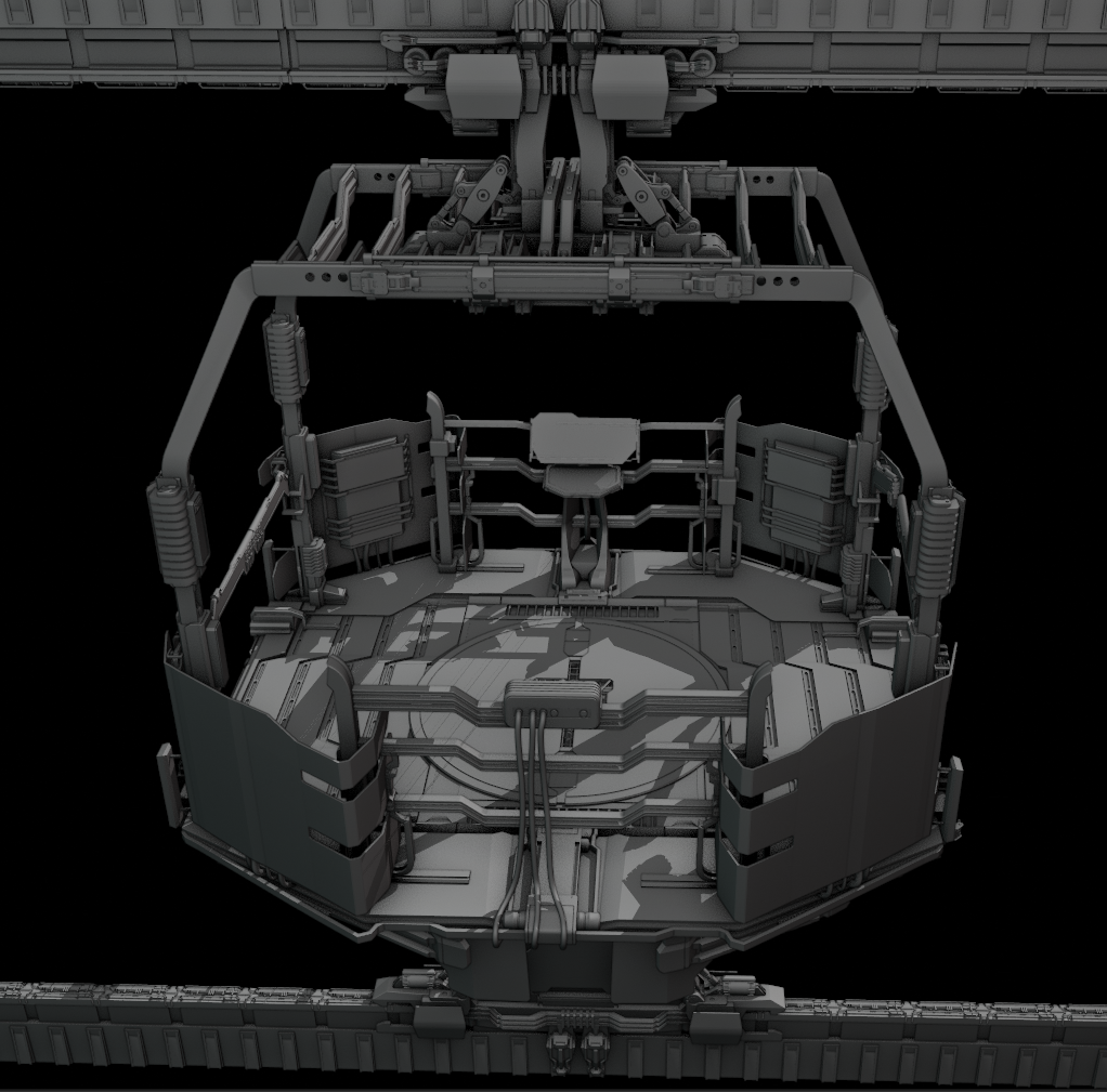
Viewport captures used to communicate structure, scale and mechanical logic before the final mood pass.
Hangar Landing Bay
The landing bay designs were another example of balancing scale, function and atmosphere. The space needed to feel large and operational, but still oppressive, with strong silhouettes, smoke and industrial light sources shaping the mood.
Ship System Server Room
For interiors like the server room, the process moved from readable structural design into a darker color and lighting pass. The goal was to keep the technical layout clear while pushing the mood toward the oppressive, reflective and smoke-filled atmosphere of the Ishimura.
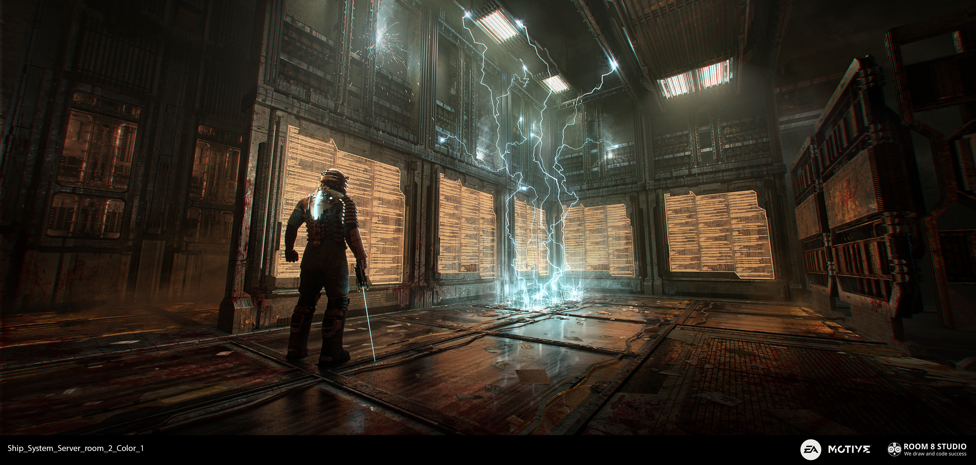
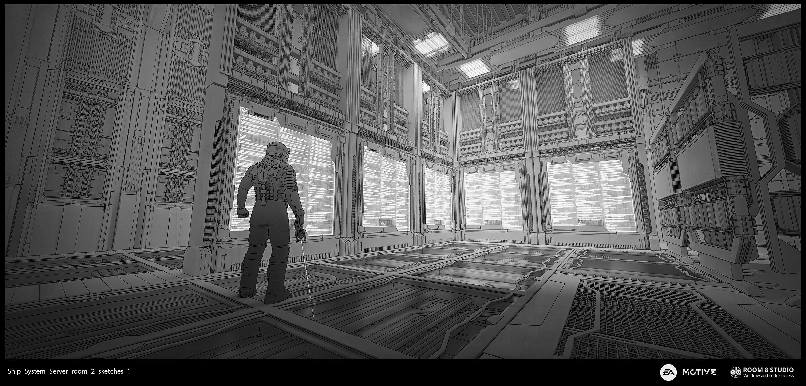
Supporting line-art design blockout.
Light as a horror tool
Early in the project, I received a mood reference from the art director: an old ruined church, a cemetery, fog and a large moon behind the structure. It was not a sci-fi reference at all, but it explained the feeling.
I had to translate that mood into Dead Space language. The moon became a hidden industrial light source. The cemetery fog became volumetric smoke. The silhouettes of graves and broken shapes became cables, chains, panels and machinery cutting into the frame.
That reference helped me understand one of the key lighting principles of the project: put the light behind the object, let the form fall into shadow, then use smoke and small accents to reveal just enough for the viewer to feel that something could be hiding there.
Design callouts and production communication
Some of the images were not meant to be final mood pieces. They were communication tools. I used callouts, reference fragments and material notes to explain what still needed to be developed: surface logic, mechanical function, material behavior, texture direction and production details.
This is an important part of concept art that is often invisible in a final portfolio. The image has to look good, but it also has to help other people make the asset.
Final Key Art
What this project taught me
Dead Space Remake was one of those projects where I felt how much art direction lives in repetition. The same ideas kept returning in different forms: layered walls, hidden light, reflective metal, smoke, ribs, modular construction, dirt, blood and functional machinery.
When these elements repeat across a project, they stop being separate details and become a language. For me, the job was to understand that language, work inside it and still find room to make each design feel specific.